Today, we speak with Kira Nezu (KN), Co-founder of Datarella, about the design of the explore app.
Q
The explore app is available for Android smartphones only. What is the reason not to launch an iPhone version, too?
KN
We started to develop explore as a so-called MVP, a Minimum Viable Product. We chose Android to start with since it offers more variety regarding sensor and phone data. So we only test and make mistakes on one platform. At some point, we will also launch an iPhone version.
Q
explore consists of two different elements: the sensor tracking and the interaction area with surveys, tasks and recommendations. Could you tell us more about the structure and the functionalities of the app?
KN
With the MVP we are trying to stay as flexible as possible to enable fast changes and bug fixing. So we decided to create a hybrid app which incorporates native and web elements. The native part basically is the container with most of the graphics. The content is dynamically fetched from our backend, whereas the result area is fully created with web views. This brings great flexibility: we can update our content within minutes.
Regarding the structure there are 3 areas:
– main content area – divided into the survey area and recommendations,
– menu area,
– result area.
Q
Regarding surveys: there are already mobile survey apps on the market. How does the explore app differ from those?
KN
Before designing the app, we did a lot of research on existing survey apps. We found that either the apps had a very technical design that reminded us of Windows 95. Other apps were very playful but done simply, i.e. one app would show two images – and the user could tap one of those to make a choice.
We want the user to have a playful experience while keeping the flexibility of different interaction formats.
Q
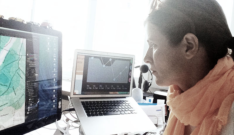
You call explore a Quantified Self app. Can you elaborate on that?
KN
The Quantified Self aspect of explore relies on regular interactions wich ask the same information from the user. In the result area we show the user her personal mood chart with her own results compared to other explore users. Currently we are working on a location heat map in which the user can see her personal location history of the past days – and also that of other users. We had some surprise moments in internal tests: it took quite a while to recall why we were at certain locations. You could compare that with cooking water for tea 5 times before finally remembering to brew your tea.
Q
So what are the next steps for explore?
KN
We will focus on adding more Quantified Self elements as results as well as offer an API for users to play with their own data. We are really looking forward to see what our users will come up with! If you are interested with playing with your data now, you are welcome to participate in our Call for Data Fiction.
Q
Thank you very much.