by Kira Nezu | 3 February 2015 | Blockchain
Data storytelling, data journalism, and even data fiction – since the advent of Big Data, we find data more and more as tool of narratives. With pattern recognition, exploratory data analytics, and especially with data visualization, data has re-centered from the quantitative to the qualitative.
More and more applications support us in using data to tell a story. Dashboards like Tableau or DataLion plug into our data sources and translate the numbers into a visual format that can be much more easily digested. Even highly multivariate data can deliver straightforward meaning to us when we use tools like Gephi, or say, the notorious Palantir. These tools also make social media analytics and text mining feasible techniques to research society, advertising, and markets.

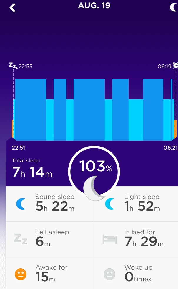
Jawbone Up not only tracks our sleep. The app also shares our data in a meaningful way with our friends – like we share our thoughts on Twitter.
Our most personal data however is generated on our mobile and wearable devices. On our smartphones, wristbands, or smartwatches, some twenty sensors continuously track our behavior and our actions. There is a plenitude of apps making use of mobile data: To support our training, to guide our routes, to find friends nearby, to share images, etc. etc.
Many people already share their daily workout via apps like Strava or Runtastic. It is even quite common to let such apps automatically post your training results into your social media timeline, e.g. to Twitter or Facebook.
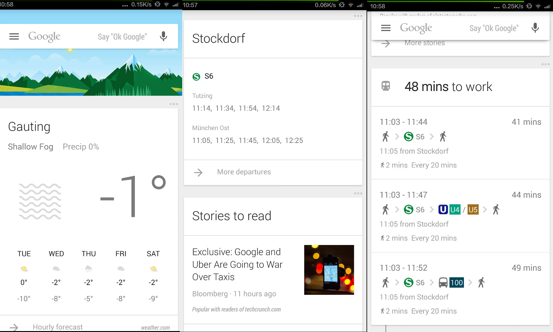
Apps like Jawbone Up or Strava not only track our workout, they also provide for an easy way to share what data they measured. We publish our training data the same way there, as we publish our stories on Twitter or Facebook. Our data becomes equivalent to the texts and images we post. The most highly integrated version of this data-as-story so far is Google Now.

Image on top: Google Now. Google Now follows the idea to display all kinds of information in the form of tiles, like Twitter or Facebook would display the posts of the people you follow in a timeline. Funny enough, Google obviously has no clue where my “place of work” seams to be.
Data is media not only regarding the content. Advertising which has by and large been data driven for decades is facing a major transformation. Media planning and buying – the art of placing ads in the most efficient way, i.e. optimizing effect for a given budget – is changing dramatically. About 20% of all ads are placed programmatic now. Programmatic buying means that an algorithm decides which exact user would be appropriate to watch the ad instead of buying the spot via explicit insertion order, as it used to be. The decision if a certain user would match with the campaign’s objective is made by predictions based on the users’ observed behavior. Data thus drives the ads we get displayed.
With the idea of ‘The Quantified Self‘, data starts to conquer even the concept of our identity. We are not only what we tell, how we appear, how we act voluntarily, but we are as well defined by our innards, by our bodies’ functions, the data that comes from our physical being. The concept of ‘self’ is changing by this notion, overcoming the strict separation of mind and body, of conscious and unconscious. The physical aspects of our lives now get equal credit, as being veritable part of our being ourselves.
Data is becoming integral part to our stories. It pervades through all the media. We should learn to see data as part of our lives the same way, we are used to tell about things with words.
Further reading:
We are content!
Data stories: From facts to fiction.
by Michael Reuter | 18 July 2014 | Blockchain
Working with lots of data, the biggest challenge is not to store or handle this data – these jobs are far from being trivial, but there are solutions for nearly any kind of problem in this space. The real work with data starts when you ask yourself: what’s behind the data? How could you interpret this data? What story can you tell with this data? That’s what we do and we want to share some of our findings with you and motivate you to join our discussion about the meaning of the data . We want to create Data Fiction.
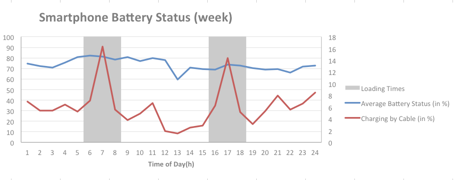
Today, we start with some sensor data collected by our explore app – the smartphone’s battery status including the loading process. Below you see sample data for our user’s behavior during the week (Feature Visual) and at the weekend (Figure 1).
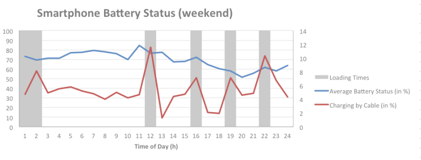
Figure 2: Smartphone Battery Status (weekend) (Datarella)
In Figure 1 you see that most users load their smartphones around 7 a.m. and (again) around 5 p.m. What does that tell us? First, we know when most users wake up in the morning – around 7 a.m.. Most probably they have used their smartphones’ alarm functions and then connect their devices to the power supply. Late afternoon, they load their devices a second time – probably at their office desks – before they leave their workplaces. During weekends, the loading behavior is different: people get up later, and maybe use their devices for reading, social networking or gaming, before they reconnect them to their power supplies.
Late rising leads to an avarega minimum battery status of 60% during weekends, whereas during the week, users let their smartphones batteries go down to 50%. This 10% difference is interesting, but the real surprise is the absolute minimum battery status of 50% or 60%, respectively. It seems that the days of “zero battery” and hazardous action to get your device “refilled” are completely over.
For some, data is art. And often, it’s possible to create data visualizations resembling modern art. What do you think of this piece?
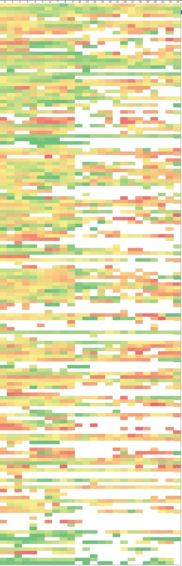
Figure 2: Battery Loading Matrix (Datarella)
This matrix shows the daily smartphone loading behavior of explore users per time of day. Each color value represents a battery status (red = empty, green = full). So, you either can print it and use it as data art on your office’s wall or you think about the different loading types: some people seem to “live on the edge”, others do everything (i.e. load) to staying on the safe side of smartphone battery status.
What are your thoughts on this? When and how often do you load your mobile device? Would you describe your loading behavior as “loading on the edge” or “safe? We would love to read your thoughts! Come on – let’s create Data Fiction!

by Kira Nezu | 18 June 2013 | Blockchain
Foursquare hat mit Unterstützung von Samsung die “Foursquare Timemachine” ins Leben gerufen: Eine animierte Infografik, welche die Check-In Historie von Foursquare Nutzern schön visualisiert. Dabei kommen folgende Daten ins Spiel:
- GPS Position
- Name der Location
- Foto der Location (falls vorhanden), nicht zwingend vom eingeloggten Nutzer
- Tipp zur Location, nicht zwingend vom eingeloggten Nutzer
- Distanz zum letzen Check-In
- Nächster Check-In (nach dem gerade angezeigten)
Auch Reisen zu ferner gelegenen Orten werden grafisch nett dargestellt. Am Ende der Animation bekommt man einen Blick in die Glaskugel geliefert: Die Timemachine gibt Tipps, welche weiteren Locations man als nächstes besuchen könnte.
Bemerkenswert auch die musikalische Untermalung.