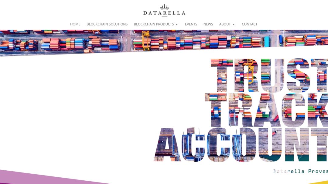
Today, we have launched our new Datarella website. Over the course of several months, we discussed how to re-fresh or re-build our existing standard WordPress template which was more text-heavy than eye-catching. In some conversations, we realised that not only our grandmas had their issues with understanding what Datarella actually offers, but also some potential clients – something we ought to change if our goal is to convert website visitors into satisfied clients.
When building enterprise blockchain solutions, one very important aspect of the work is to show the actual outcome of the projects More specifically, it is key to clearly demonstrate why and which blockchain technology has been used and how it benefits the participants in the use case. The best way to bring a smile on the executive’s face is to either make her an active participant in a live demo, shoot a respective video or use photos of a real life showcase. You can’t beat the power of images and a live experience!
With these experiences in mind, we decided to strip our blockchain technology heavy content down to a minimum and use it more as an explainer of images that describe actual live use cases. In other words: we planned an image-heavy website that should induce a feeling of physical reality – visitors should easily understand the implications and benefits of Datarella’s work. In addition, we ignored side projects and focused on our three key areas of enterprise blockchain applications: Finance, Mobility and Supply Chain.
With this topical focus, a new, fresh look, with many images and symbols, we hope to make it clearer and easy to understand what our Enterprise Blockchain Solutions work is about and what our fantastic target-oriented teams in Munich and Gdansk create. Of course, we highly appreciate your feedback – either as comments, emails or in person at one of our Blockchain Meetups!
